Analysis of Favorite Websites
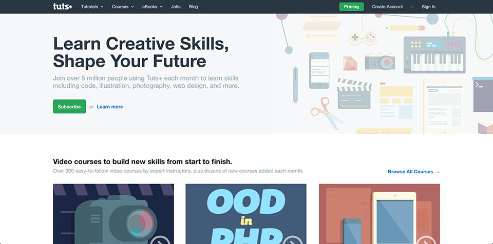
Tutsplus.com
Tutsplus.com is my all time favorite site on the net! It has well made tutorials, tips, and books on just about every topic a designer or web developer would be interested in from text editors and programming to design and photography.
When you first land on their page the subscribe and pricing buttons are the most prominent, which makes sense. However, the rest of the page's design, while clean, is still boring, scattered, ugly, and confusing. However, despite it's lacking design the site is still a one-stop-shop for quality training on all things web related. As such it contains a wide array of video and text tutorials and a few books. Which honestly are almost all fun, clear, informative, organized, and engaging.
Unfortunately, form and function do not really come together in this site. A flat UI, scattered elements, a terrible search engine, and lack of extensive filtering make looking at the page less than desirable and finding specific content annoyingly difficult. However, Google can be used to alleviate some, but not all of the searching difficulties. It is also moderately difficult to go to other content on either the home page or an internal tutorial page, however, the side bar with related content on individual tutorial pages is really helpful and inspiring. Navigating and finding content is also annoyingly difficult. Usually I will use Google and the related content sidebars to find relevant content.
However, the bottom line is that despite the site's lacking design, search, and navigation it is still an awesome resource and I usually feel good, and often great, after being here for long periods of time. That is until I try finding something specific and then I can get very annoyed.
Finally keep in mind that for most of the really good content you need a subscription, which I have purchased for several years without hesitation.
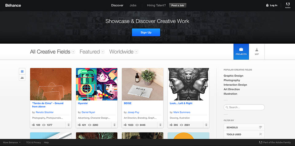
Behance.net
Behance.net is one of my favorite sites because it is a beautiful, well organized, and easy to search repository of designer and artist portfolios.
Like any good site the signup button is the first thing you will notice when your there. Curiously, however, the projects button, which I have never used, is also very prominent. If I was going to describe behance's design with five adjectives they would be clean, beautiful, organized, balanced, and clear.
Since this website serves as a portfolio and social network for professional designers and artists it has many tools for them to easily share their work, get and give feedback, and find inspiration. It should therefore come as no surprise that this site consists mostly of photos and photo metadata.
The photos and their data can be described as beautiful, informative, organized, helpful, and downright fun. I believe the site's design follows it's content and purpose closely by providing a clean and easy to use interface striking a good balance between beauty and function. For example it is very easy to find what I am looking for from the home page as they have many options and filters. However, it is not as easy to search from interior pages, as they want you to use their modal system for displaying content, which I am still getting used to. I am sure I will love it eventually.
The only aspect of the site I do not like is navigating it's content. There is no option for pagination and the URL does not update as you scroll, which makes navigation and bookmarking near impossible. Despite this I still feel great even after hours of aimless meandering.
Finally, monetization is not a problem on this site, which is kind of surprising for an Adobe product. The only hint of monetization is the 'Post a Job' button, which I assume is monetized, but I have never used it.
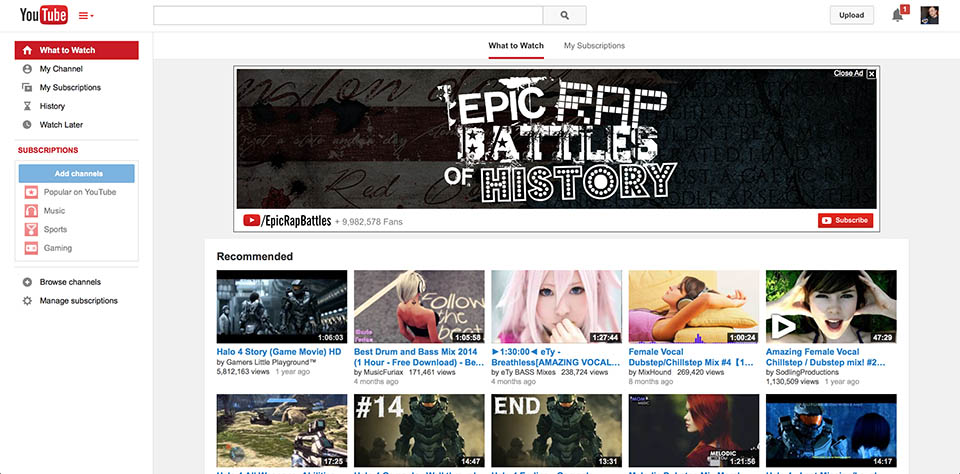
YouTube.com
Youtube.com is one of my favorite sites, because it is fun, inspirational, and informative. I can watch a music video, an Arduino programmed water fountain in Japan, or an instructional video on stop motion photography all from the same site. So cool.
Upon landing on their home page you will notice that the top left corner is usually the most prominent which contains the YouTube logo and their main navigation panel. This makes sense to me since they only get ad revenue if you find content engaging enough to suffer through a 15 second commercial to get to it. So getting visitors to the content they want quickly and accurately is most important.
Like all things Google the design is quite boring, but more importantly, it is also simple, clear, well organized, and engaging. The latter four qualities are important given that this website specializes in hosting, organizing, and displaying video content of all sorts. Content that I wish included a channel for more artistic and professional videos such as short clips from cinema and 3d visualization students and film festivals. I am starting to navigate more and more to Vimeo because of this. Despite this omission most of YouTube's content can be described as simple, well organized, amateur, although sometimes professional, and almost always engaging.
Not only does YouTube have great content but it's design and function mesh well and serve to provide easy access to the video content users are looking for. It is very easy to search and browse YouTube. It's a Google subsidiary for Goodness Sake!
The bottom line is that I love YouTube for it's entertainment and educational value. However, I often feel a bit hallow after being on YouTube for a long time. It is just too easy to get distracted and soon I find my self drifting aimlessly in a sea of irrelevant, but oddly engaging content. So while I try to limit my YouTube consumption it constantly sucks me in and I am sure they have made a bundle in ad revenue from my frequent visits.